FortePay
WEB & APP
Send and receive money without an account.
OVERVIEW
ForteBank, a leading Kazakhstani bank, launched a P2P mobile payment app in the landscape of Tenge's instability, noticing 37% of citizens to withdraw funds frequently.
We were briefed to offer a digital solution to retain and attract customers from competitors, thereby integrating more users into the ForteBank ecosystem and revolutionizing customer acquisition in Kazakhstan's banking sector.
OUTCOMES
1st
Kazakh bank to digitise peer-to-peer and cross-bank payments
THE PROJECT
Project Team:
UI Designer (Me)
UX Designer
Project Manager
Client liaison (RU)
Turkish full-stack overseas development
Unique Culture
Navigating Kazakhstan's unique cultural and financial landscape is crucial for market appeal. The nation grapples with white-collar crimes and currency instability, leading to diversified finances in EUR and USD. A pronounced generational divide exists, with elders speaking Kazakh and the youth preferring Russian, amid a fintech and digital banking evolution eyeing China and Russia's lead. National pride shines through in the ubiquitous turquoise and red, symbolising its natural beauty and deep-rooted equestrian heritage.
Trifecta of Users
ForteBank segmented its users into three categories: (1) Guests - first time users; (2) Potentials - previous users but not ForteBank customers; (3) Customers, those with ForteBank accounts. Personas Zaure, Marat, and Dilnaz were created for each segment to tailor user journeys across transactions like sending or collecting money and exploring ForteBank's offerings, ensuring a customised approach for diverse banking needs.
Product Development
Starting with wireframe user flows, we leveraged ForteBank's existing component library for the core experience of inputting card details for transactions. The P2P service, framed by this technical foundation, introduces a modern value proposition focusing on instant payments and speed, enhancing the overall user experience.
FortePay Brand
Envisioning a custom illustrative approach to digital banking, I aimed to infuse user journeys with moments of joy through cultural and natural motifs, leveraging the rich tapestry of local architecture, scenery, and colours. Initially, the client favoured 'Whiz' to highlight speed, but after exploring various concepts, we found common ground and mutually agreed on the name FortePay, marrying tradition with modernity in our digital banking experience.
THREE BIG TAKE-AWAYS
1/ Shoestring User Validation
Lacking a budget for user interviews or testing, I turned to anthropological research, delving into Kazakhstan's social and political spheres. This approach, enriched by demographic studies and video documentaries, enabled me to develop three personas. These personas were later validated by a Russian consultant, who facilitated communication between our team and the client, ensuring the insights were grounded and relevant.
User Persona Example
Zaure (Guest) - 28, single and owns an apartment in Astana. She drives to work in the banking working as a Fraud Strategist.
Marat (Potential) - 32, married with two children and lives in Almaty where he works as an engineer on the Power Grid.
Dilnaz (ForteBank Customer) - 22, currently engaged but lives with her parents in Karagandy and has an MSc in Educational Leadership.
Mapping User Experience
Some of these fundamental journeys ask questions of each individual personas. How does Zaure collect money? What if Marat wants to open a ForteBank account? How does Dilnaz send money?
2/ Brand Alignment
The client’s suggestion of 'Whiz' posed a challenge due to its association with unpleasant noises and lack of clear connection to the product or service. I explored alternatives like 'Quik' and 'Pronto' to convey both direction and speed more universally.
Kazakhstani symbolism
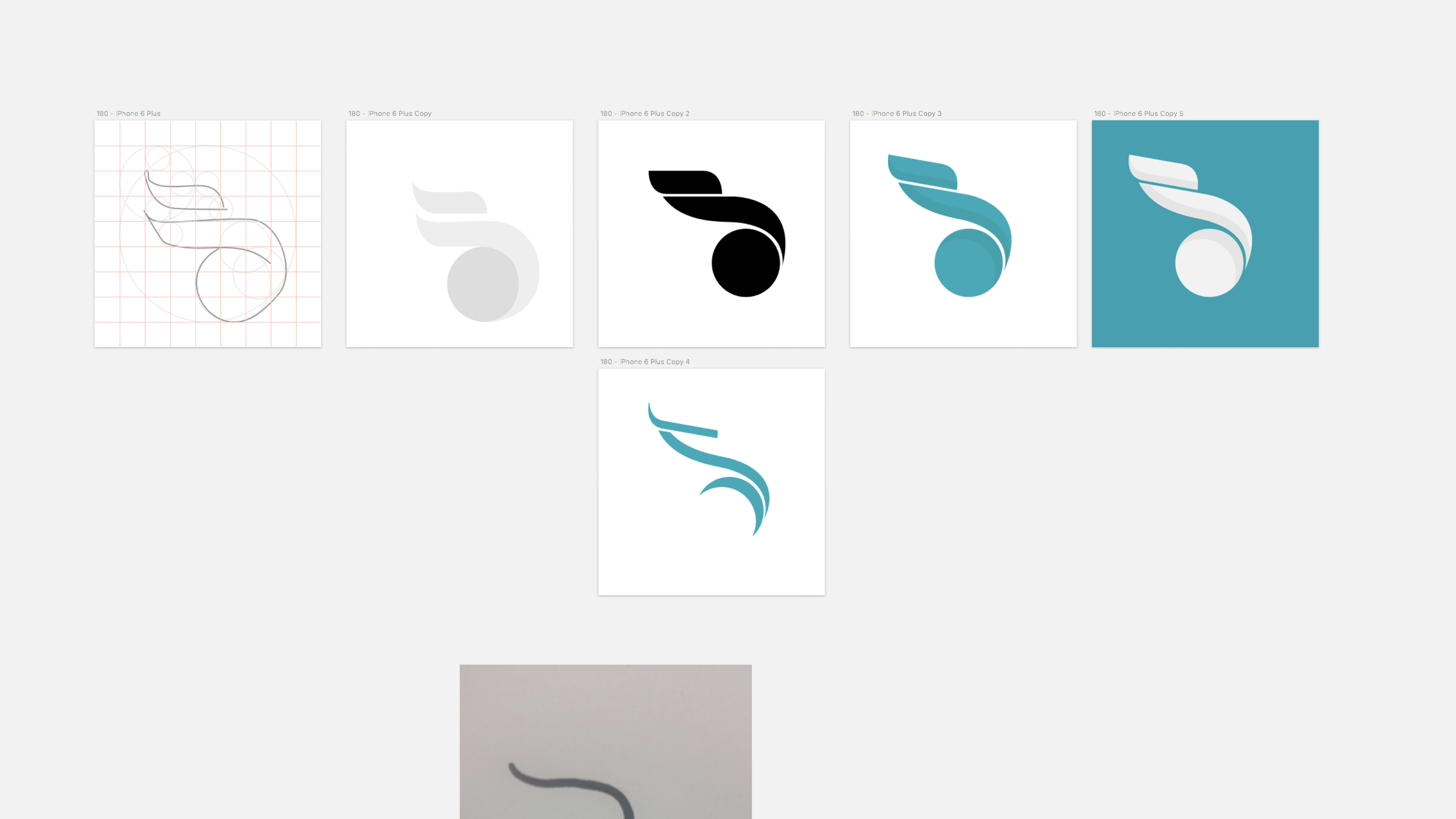
We began taking the principles ForteBank already carried and added speed more importantly for Whiz. Focussing on sports and cultural heritage we saw common themes around the use of the horse and the eagle. Our shift towards the wings of the eagle was based on modernising the look as using references to horses may be old; using wings and the notion of flight signify a light weight system and also a reference to carrier birds which sent important messages in the past.
Visual development
I experimented with wing forms, then realised it actually looked like the beak and head of an eagle, upon a slight tilt it gave the sense of movement and speed. ‘Quik’ came from representing fiscal handover - I found a rotational symmetry which symbolised an infinite relationship taking place. ‘Pronto’ used dashes to signify a coin accelerating through a slot.
3/ Activation Nudges
The ultimate objective was to convert guests or potential customers into account holders. I utilised the brand's identity, employing a rewarding trigger via colour and symbolism effectively to guide users towards opening an account.
Opening an account
This unique approach involved priming users with visual confetti whenever there was money ready for collection. Once they had added their card details to collect the money we would create a larger sense of celebration at the end. Once they navigated back to their home screen they could see the same confetti representation of an unboxed card signifying the action of opening an account.
REFLECTION
Success: Creating the first Kazakh P2P cross-bank payment service
Adapting to Challenges: Working across different cultures such as Kazkah client and Turkish development team.
Lessons Learnt: How to effectively carry out research and user-validation with zero to little budget
Skills Developed: User journey mapping and innovative branding.
Read more case studies


